New Improved Interface
We are very excited to announce the release of a new and improved interface. This new look will be released in stages. We are planning to release the first stage on Tuesday August 16th. Some of the major highlights of this first stage are:
Navigation Menu
All text on pages are much easier to read.
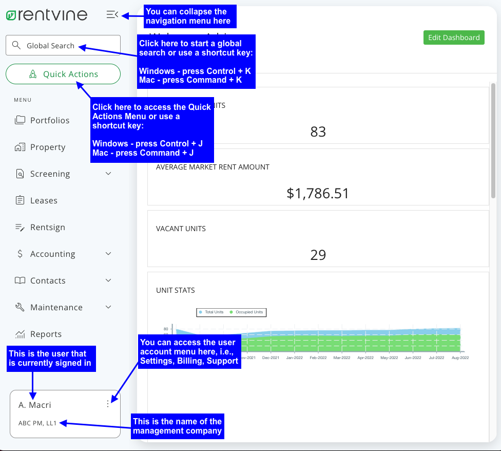
The left navigation menu has a new look to make it easier to read and navigate.
Collapsing the left navigation menu now shows Icons to represent the different sections of Rentvine. This way you can keep the left menu collapsed and still easily navigate around Rentvine.
The Global Search, Quick Actions and User Account is no longer on the top of the page. Those items have now moved over to the navigation menu.
Global Search and Quick Actions are at the top of the menu
User Account is at the bottom of the page
Quickly access the global search by using a keyboard shortcut
Windows - press Control + K
Mac - press Command + K
Quickly access the Quick Actions Menu by using a keyboard shortcut
Windows - press Control + J
Mac - press Command + J

Global Search
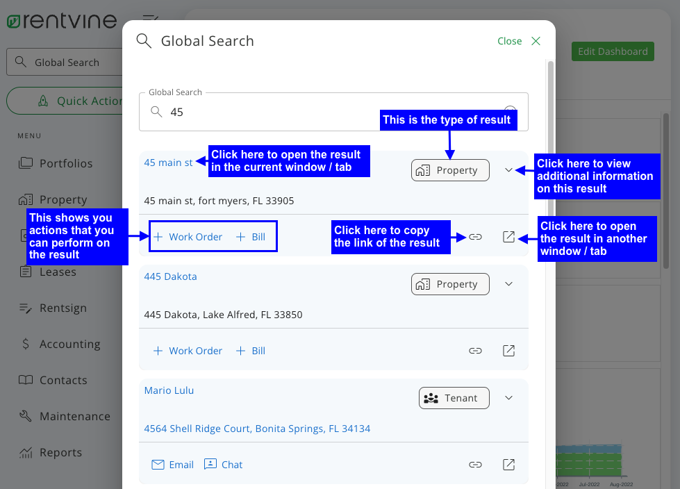
The Global Search results has improved functionality:
Results give you additional options as to how you want to open those results.
Some results have an arrow that if clicked shows additional information
Additional Action items are available depending on the type of object that is returned.
Now you can search for base reports in the Global search by typing the name of the base report

Portal Views
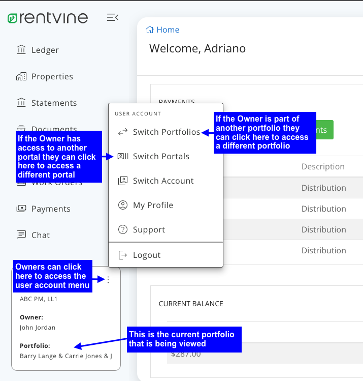
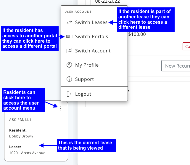
Resident, Owner and Vendor Portals have a new left navigation menu as well and all text on pages are much easier to read
User Account information is now in the left navigation menu at the bottom of the page
Owner

Resident


